
Your wedding invitation is the very first glimpse your guests get of your big day. Before they see the venue, the flowers, or your dress, they hold a small piece of paper in their hands and form an impression. That impression is shaped, more than anything else, by your choice of wedding invitation fonts.
Choosing the right typography can feel overwhelming with thousands of options available. This practical guide walks you through selecting fonts that match your wedding aesthetic, venue, and color palette, so your invitations feel cohesive, elegant, and unmistakably you. A comparable breakdown sits on katrinacrouch.com.
Why Wedding Invitation Fonts Matter More Than You Think
Typography sets the tone. A flowing calligraphy script whispers romance and tradition, while a clean sans-serif shouts modern minimalism. Before diving into specific font pairings, remember these three golden principles:
- Readability first: Guests must be able to read the date, time, and location at a glance.
- Contrast is key: Pair fonts that differ in weight, style, or personality rather than fonts that look similar.
- Less is more: Stick to two, or at most three, font families across the entire invitation suite.
The 3 Font Rule Explained
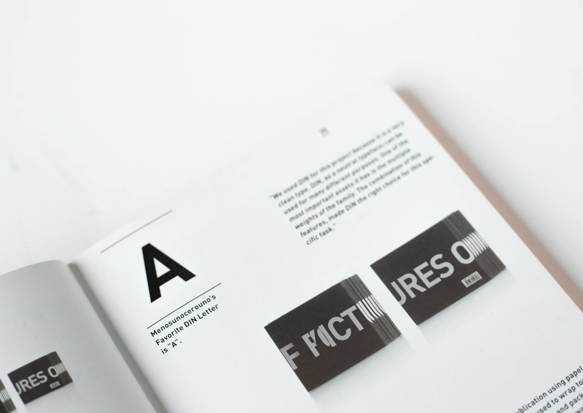
The 3 font rule is a design principle that recommends using no more than three typefaces in a single design. For wedding invitations, this typically breaks down as follows:
- Display font for names or key headings (usually a script or serif)
- Body font for details like date, venue, and RSVP information (usually a clean serif or sans-serif)
- Accent font for small details like monograms or dates (optional)
Going beyond three fonts creates visual chaos and dilutes the elegance of your stationery.
Font Pairing by Wedding Style
Your wedding aesthetic should drive your typography choices. Below, we break down the four most popular wedding styles and the font combinations that suit each one perfectly.
1. Classic & Traditional Weddings
Think ballrooms, cathedrals, black-tie attire, and timeless elegance. Classic weddings call for refined, formal typography with a sense of heritage.
Recommended pairings:
- Playfair Display + Cormorant Garamond
- Cinzel + Lora
- Tangerine + Noto Sans
Best venues: Historic estates, chateaus, cathedrals, luxury hotels.
Ideal color palette: Ivory, champagne, gold, deep burgundy, navy. This overview fills in the gaps.
2. Modern & Minimalist Weddings
For couples drawn to clean lines, urban venues, and contemporary design, modern fonts create a fresh, sophisticated feel.
Recommended pairings:
- Montserrat + Cormorant
- Futura + Didot
- Poppins + Libre Baskerville
Best venues: Rooftops, art galleries, industrial lofts, glass-walled venues.
Ideal color palette: White, black, greige, blush, sage.
3. Boho & Romantic Weddings
Boho weddings blend free-spirited energy with romantic touches. Flowing scripts paired with organic serifs capture this dreamy vibe.
Recommended pairings:
- Alex Brush + Open Sans
- Great Vibes + Josefin Slab
- Pinyon Script + Karla
Best venues: Garden parties, vineyard terraces, beach ceremonies, forest clearings.
Ideal color palette: Terracotta, dusty rose, sage green, cream, warm beige.
4. Rustic & Country Weddings
Barns, wildflowers, and mason jars call for typography that feels handcrafted and warm. Slab serifs and casual scripts work beautifully here.
Recommended pairings:
- Amatic SC + Lora
- Sacramento + Playfair Display
- Homemade Apple + Merriweather
Best venues: Barns, farms, mountain lodges, country inns.
Ideal color palette: Kraft brown, forest green, mustard, ivory, dusty blue.
Quick Reference Table: Fonts by Wedding Style
| Wedding Style | Primary Font (Names/Headings) | Secondary Font (Details) | Mood |
|---|---|---|---|
| Classic | Playfair Display | Cormorant Garamond | Timeless, formal |
| Modern | Montserrat | Cormorant | Clean, sophisticated |
| Boho | Alex Brush | Open Sans | Romantic, flowing |
| Rustic | Sacramento | Lora | Warm, handcrafted |
Font Pairing Principles That Actually Work
If you want to explore beyond the pairings above, follow these tried-and-true typography rules:
Contrast, Don’t Match
Pair a decorative script with a simple sans-serif or serif. Two scripts together look messy. Two sans-serifs look flat.
Match the Mood
A whimsical handwritten font next to a stiff corporate font sends mixed signals. Both fonts should share an emotional register even if they differ in shape.
Mind the Hierarchy
Your names should be the largest and most stylized. Details like time and address should be smaller and highly legible.
Test at Actual Size
A script that looks stunning on your computer screen may become unreadable at invitation size. Always print a test copy before committing.
Matching Fonts to Your Color Palette
Typography and color work hand in hand. Here’s how to align them:
- Deep, saturated colors (burgundy, navy, emerald) pair beautifully with elegant serifs and refined scripts.
- Soft pastels (blush, dusty blue, sage) complement flowing calligraphy and delicate serifs.
- Neutral tones (ivory, taupe, kraft) work with almost any font style, especially handwritten and slab serifs.
- Bold monochrome (black on white, white on black) demands clean sans-serifs or high-contrast display fonts.
Common Wedding Invitation Font Mistakes to Avoid
- Using too many fonts: Stick to the 3 font rule.
- Choosing illegible scripts for body text: Save fancy scripts for names only.
- Ignoring the envelope: Your addressing style should match your invitation typography.
- Overusing italics or all caps: Both can strain the eye when used heavily.
- Forgetting cultural context: If you’re incorporating a second language, ensure your fonts support those characters.

Bringing It All Together
Your wedding invitation is a tiny work of art that carries big emotional weight. By choosing fonts that reflect your venue, color palette, and personal style, you create a coherent story that begins the moment your guests open the envelope.
At Bridalfeel, we believe every detail matters, and typography is one of the easiest ways to elevate your stationery from ordinary to unforgettable. Take your time exploring pairings, print samples, and trust your instincts.
Frequently Asked Questions
What font is most popular for wedding invitations in 2026?
Playfair Display remains a top choice for classic weddings, while Montserrat paired with a delicate script like Alex Brush dominates modern and boho invitations this year. 23 Best Wedding Font Pairings covers this in more depth.
Can I mix a script font with another script font?
Generally no. Two scripts compete visually and reduce readability. Instead, pair one script with a serif or sans-serif for clean contrast.
What is the best font size for wedding invitations?
For body text, aim for 10 to 12 points. Names and headings can range from 24 to 48 points depending on invitation size. Always print a proof to check readability.
Are free wedding fonts good enough for real invitations?
Absolutely. Platforms like Google Fonts and 1001fonts offer beautiful, print-quality typefaces. Just verify the licensing terms if you plan to use them commercially.
Should the font on my save-the-date match my invitation?
Yes. Consistency across your stationery suite (save-the-dates, invitations, RSVPs, menus, thank-you cards) creates a polished, professional feel and reinforces your wedding branding.